Case Study
Audience-First Architecture
Association of American Medical Colleges
Product Manager, Digital Experience
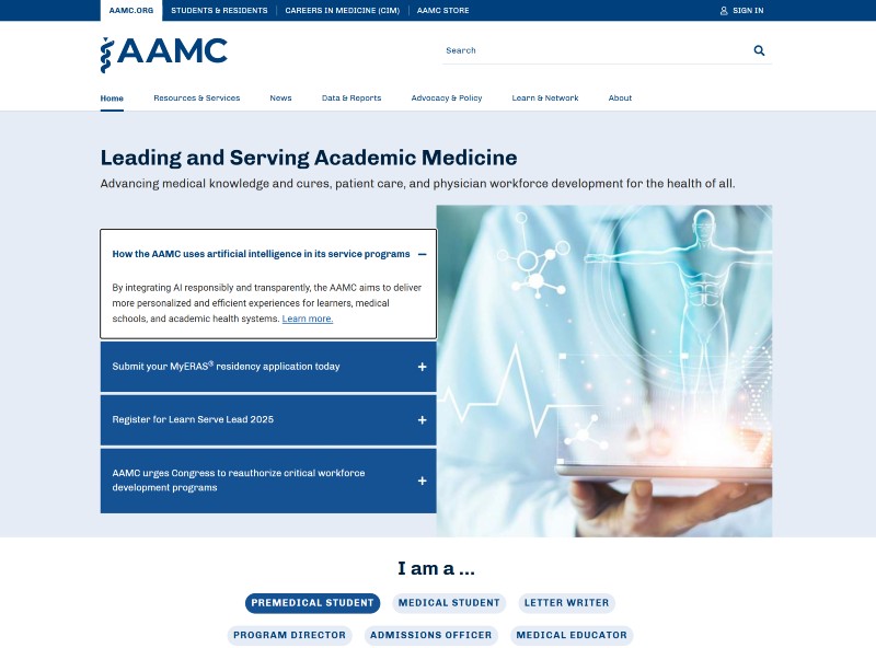
Six distinct audiences shared one homepage with no clear entry points. I led a time-bound redesign that reduced first-click friction by giving each audience a clearer path into the site. I was later told the audience model went on to organize content across the whole site.
Note: this screenshot is a later state of aamc.org, not the launch build.
The Product Decision
The core decision was to stop asking people to navigate the organization and instead ask them to identify themselves.
Rather than expanding dropdown menus, I introduced audience-first self-selection paths. People no longer had to understand how AAMC was organized before choosing where to go.
The homepage became an orientation layer, not a content index.
Key Facts
- On this project
- Lead IA, digital experience
- Scope
- IA, audience routing, 4-zone model
- Team
- Led UX + UI + engineering partners
- Constraint
- Validated against CMS before visual
The Problem
Complex navigation
The menus described how AAMC was organized. A visitor arriving with an errand had to translate that structure before they could act on it.
Content overload
The homepage presented volume before hierarchy. Finding one thing meant reading past everything else.
Hidden calls to action
The primary actions were styled like the copy around them. They read as text, not as actions.
Ineffective search
Search was hard to find, and its results were loosely related. When browsing failed, nothing caught the visitor.
What the Redesign Had to Achieve
- Increase homepage engagement by 15% or more through clearer navigation.
- Improve call-to-action visibility for six distinct groups: premed students, medical students, letter writers, program directors, admissions officers, and medical educators.
- Reduce bounce rate by shortening the path to content and letting people place themselves.
- Create an information architecture that could absorb future audience needs without another rebuild.
Architecture & Interaction
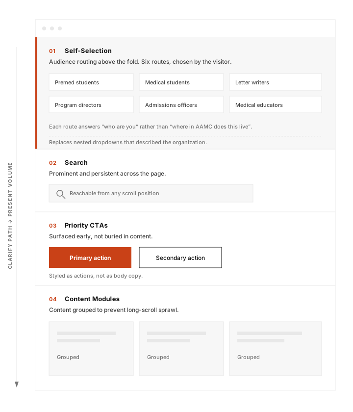
The homepage was restructured around four zoning principles.
Interaction Model
The new model clarified paths before presenting volume. Navigation depth was intentionally reduced so people could reach relevant content in fewer steps. I checked the routing and content model against CMS constraints before visual refinement so implementation problems would not surface at the end.
Process
3 phases1. Research & Synthesis
This project built on existing user research. My work was to synthesize those findings, redefine the audience segmentation into six distinct groups, and map the first-click friction points for each.
The navigation reflected the organization rather than user intent. Mapping the six audience journeys made the core problem visible: the homepage was answering the wrong question.
2. Structural Prototyping
I sketched and wireframed multiple models in Sketch before any visual design began. Each approach was tested against the six audience journeys before we converged on the four-zone model.
That model defined audience routing, CTA placement, and content hierarchy. No visual execution began until those decisions had been validated.
3. Validation
Usability validation showed that audience self-selection reduced first-click ambiguity.
I validated the proposed model against CMS constraints with technical staff, before the visual design was finalized. AAMC ran on an older, well-established system, and the question was whether a new information architecture would disturb how things were already set up.
Impact
After the redesign shipped, call-to-action click-through rose 20% and bounce rate dropped 15%.
After I left AAMC, I was told that homepage engagement had increased 200% post-launch. I did not have access to the underlying analytics, so I treat that as a reported result rather than a metric I independently verified.
The audience model was not just a homepage fix. The same logic could extend beyond the homepage instead of making people repeatedly navigate AAMC's internal structure.
The model outlasted the pages I shipped. Today the site groups its Resources and Services menu by audience rather than by department: premeds and applicants, medical students, prehealth advisors, letter writers, admissions and financial aid officers, and medical schools and teaching hospitals. I did not design that navigation. I checked it in September 2026. What survived is the organizing question: who are you, rather than where does this live.
Reflection
The most important decision on this project was also the earliest one: stop organizing the homepage around what AAMC does and start organizing it around who is trying to use it.
Once that framing was settled, the rest of the work became easier to evaluate. Navigation, content hierarchy, and calls to action all had to answer the same question: does this help one of those six audiences get where they need to go?
The hard part was not deciding what the homepage should look like. It was deciding what people needed to see first.