Case Study · iOS
Survival Budget: Priority-Based Budgeting
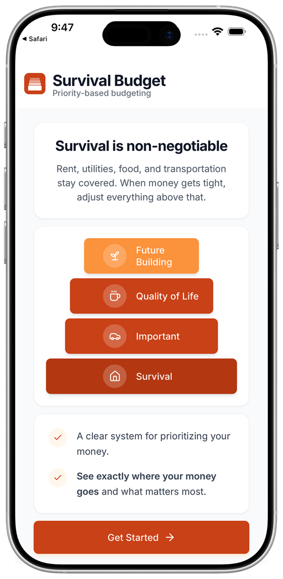
Traditional budgeting apps present more data when money gets tight. Survival Budget organizes expenses into four priority tiers so you know what to protect first and what to cut without guessing.
The Product Decision
The core decision was to shift from category-based budgeting to priority-based budgeting.
Most budgeting tools track expenses. They do not guide tradeoffs.
Instead of asking users to interpret numbers under stress, the hierarchy does the thinking for them.
Every expense belongs to a tier with a clear action label attached. The structure reduces cognitive load when income drops and decisions must be made quickly.
Key Facts
- Role
- Designer + developer, solo
- Scope
- iOS product, 0 to 1
- Craft
- Priority-based decision model
- Outcome
- Live, App Store
- The core mechanic is a four-tier allocation model where each tier carries an action label. The hierarchy does the thinking for the user under stress.
- The system shifts budgeting from category tracking to priority-based decision guidance.
- The app is fully local-first. All financial data stays on-device. No backend. No analytics.
- Tier logic and state transitions are protected by automated testing with Vitest and Playwright.
- Accessibility is treated as a structural requirement at the component level.
Architecture & Interaction
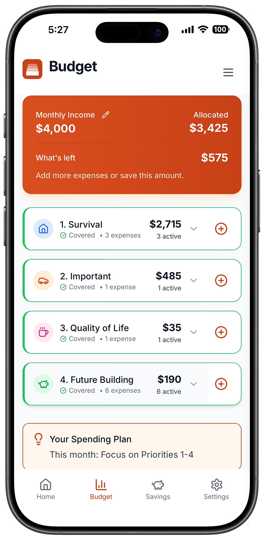
Survival Budget is structured around a single governing system: a four-tier priority hierarchy. Eight screens. Four-tab navigation. One decision model applied consistently across every interaction.
Survival
Core obligations. Non-negotiable.
Important
Necessary but flexible. Managed under pressure.
Quality of Life
Discretionary. First to compress when the budget tightens.
Future Building
Deferred when unstable. Restored when capacity returns.
Interaction Model
The app is organized around four priority tiers with action labels, not categories. Each tier tells the user what to do, not just how to classify an expense. The highest tier covers what must be protected. Each tier below it represents a decision the user can make under constraint. The structure forces the most important decisions to the top and removes the need to weigh everything equally when money is tight.
Technical Implementation
React · TypeScript · CapacitorLocal-First State
All data persists to localStorage. There is no backend, no sync and no analytics. The only copy that leaves is an export the user asks for, as JSON or CSV from Settings.
This reduces infrastructure complexity and keeps performance predictable.
Automated Testing
Testing is the guardrail on generated code, and it isn't sufficient on its own. Vitest covers unit logic, Playwright covers end-to-end flows across tier transitions and editing states, and axe runs inside the Playwright suite for accessibility. All three run before a submission build.
The suite tells me the code runs. It doesn't tell me the product is right, so I still verify by hand and convert every catch into a regression.
Accessibility
Buttons enforce a 48px touch target on every variant. Compact controls hold a 44px floor, the WCAG 2.5.5 minimum, and nothing interactive ships below it. Contrast meets WCAG 2.1 AA across core flows, with one onboarding illustration kept as a documented exception.
Accessibility decisions were made at the component level, not layered on later.
What Green Didn't Catch
I built in React and TypeScript with Claude Code. It accelerated component scaffolding, state wiring, and the allocation and affordability logic. The four-tier model, the decision to enforce order, the cuts, and the interaction feel stayed mine. AI moved the execution. It did not make the product decisions.
On August 6, 2026, the expense modal was stripping decimals. Typing 12.34 stored 1234. In a budgeting app, that isn't a rounding error. It's the whole product failing quietly.
An earlier fix had made parsing cent-safe in the onboarding fields. The live expense modal and its inline fallback were left on the old parser. The fix landed in one place and not the others.
Here's what makes it the story worth telling. At that moment, everything automated was green.
None of it caught the bug.
I did, by typing a number into the running app.
Then I wrote the regressions to reproduce 12.34 → 1234 first and pass second, so the gap couldn't reopen.
That's the line between what I automate and what stays human. Automation tells me the code runs. It doesn't tell me the product is right. I put my hands on the running app before I trust a green dashboard.
Process
3 phases1. Research & Framing
I ran beta testing with at least twelve people who had abandoned budgeting apps, six of them from start to finish. They did not need more data. They needed guidance.
The product direction shifted from tracking to decision support.
2. System Design
The four-tier model was defined first. Labels were written before components were built.
The hierarchy became the system constraint that shaped layout, editing behavior, and navigation depth.
3. Iteration & Refinement
Post-beta cycles focused on edge cases, state clarity, accessibility adjustments, and visual grounding.
Header alignment, card spacing, and interaction timing were refined so the product feels stable under stress.
Impact
I built Survival Budget to replace category tracking with a decision structure that works under financial stress.
- The four-tier hierarchy (Survival, Important, Quality of Life, Future Building) is fixed and not configurable. The order is the feature.
- All six beta testers rated the priority system 5/5. Three of the six said they had never found a budgeting method that worked before.
- The app does not treat financial difficulty as failure. Over-allocated states use orange and say "Over Allocated," not "Over Budget." Red is reserved for actual errors, never for the state of your budget.
- A borderline state (50 to 99 percent covered) acknowledges partial progress rather than collapsing all shortfalls into one alarm state.
- All financial data stays in localStorage, apart from an export the user chooses to make. The App Store privacy label reads “Data Not Collected.” The simplest security is not holding the data.
The product shows that a fixed priority structure removes decisions at the moment when budgeting tools are most likely to be abandoned.
Reflection
The core decision was fixing the four-tier hierarchy and not making it configurable. Keeping the hierarchy fixed meant the interface never had to ask users to define their own priorities under financial stress.
Defining the hierarchy before designing the interface meant every layout, label, and interaction had to serve the same priority order. Architecture followed principle, not the other way around.